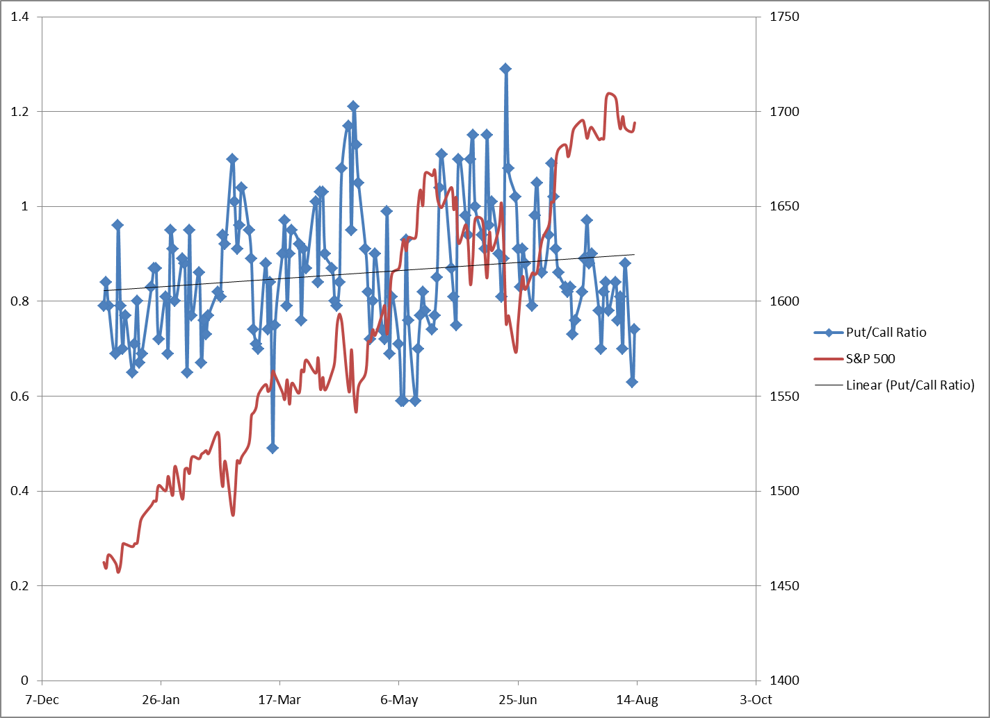
I got my hands on some Option Put/Call data from the Options Clearing Corporation. This data has 2013 YTD daily Put/Call ratios for equity and index options. I decided to compare it to the daily S&P 500 prices to see if I could find any useful info:

The data is pretty scattered. Looking in hindsight, you can see that some of the most extreme spikes in the P/C ratio corresponded to market bottoms, while low ratios occurred closer to tops. The relatively low P/C ratio currently would hint towards the current market price level being closer to a top to me.
I came up with a measure called the On Balance Put/Call Ratio (OBPC). My OBPC is kind of like an On Balance Volume. I used a value of 0.86 to denote a balance between puts and calls. A daily P/C number higher than that is basically bearish, and put volumes are high compared to calls. A P/C number under 0.86 is bullish, since the calls are getting a better share of volume compared to puts. I chose 0.86 because it was close to the average value for the year so far (see the black trendline in the chart above), and it made the swings on the OBPC chart stand out more than going higher or lower as a threshold. The OBPC was calculated by taking the difference between 0.86 and the daily P/C number, and then adding it to the prior day’s number (starting with 0 on Jan 2 of 2013). So if we have a day of 1.0 P/C, that will drop the OBPC down (0.86-1.0=-0.14). If we had a day of 0.6 P/C, that would raise the OBPC (0.86-0.6=0.26). So a rising OBPC is getting more call volumes relative to neutral, while a falling OBPC is getting more put volumes. This roughly correlates to up being bullish and down being bearish on the chart.
Here’s the results below. I’m not sure that there’s anything there. It seems like sometimes the crowd got it right (Feb-Mar), while the crowd should have been faded from Apr-Jul. The July rally was mistrusted, but now in this sideways August the bulls are roaring back.
Please post a comment if you have any thoughts!