Archive for October, 2010

Improved Generalized Trailing Stop Strategies for Think or Swim

October 31, 2010

With the latest release, we now have a TOS function in our strategies called “entryprice()”. It returns the price of the most recent entry while using strategies. This is great news for us, because it means we no longer have to reproduce our entry signals in a trailing stop strategy like I described in my earlier post! While it doesn’t make a trailing stop strategy any easier to code, it does make them universal instead of entry specific.

I have created two strategy files for my Donors that use this function to approximate having a trailing stop in the market. There’s one for long exits and one for short exits. Here’s a picture of one in action:

The way this works on the long side is this: after entry, a stop is placed x points (or percent, there is an input) below the entry price. As we make new highs, the stop loss is trailed up x points/percent below that high. It’s the opposite for shorts. In the picture, we didn’t get a big enough retracement from each subsequent low to trigger our trail. It just kept getting moved down until it finally hit.

With these files, you just add them to any chart that you are running any entry strategies on, and they will just work, no other coding required. These strategies are available to blog donors. You can download “TrailingStopStrategies.zip” which contains the strategy files from the Donors Only folder at “Released Thinkscript Strategies” from my Google site. If you are trying to do it yourself, leave a comment and I can answer questions or give some pointers.

Cumulative Tick Study (v2) for Think or Swim

October 25, 2010

Here’s the v2 for my cumulative tick study. See the prior post for the full explanation of what it is doing and why.

Changes:
I include the trend correction automatically. I took the paintbars out. The “ema” input is now called “smooth” for clarification.

New inputs:
“Filter”–for the high and low bands, you can filter on a minimum tick level such that the bands don’t overweight small adverse tick values after a pronouced move. Basically, if you think +-300 on the NYSE tick is “noise”, then enter 300.
“Symbol”–you can use any symbol you want: $TICK, $TICKQ, $TIKI or anything else.

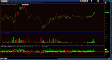
You can also hide the cumulative tick plot or show it. If you show it, you get a plot that looks like this:

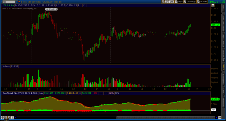
If you hide it (default) then you get a chart like this, where you can see the detail of each tick reading:

The color of the dots shows you the color of the cumulative tick, just the same as if you were showing the cumtick plot. Usually, we don’t care about the absolute value anyway, just the trend of it, so this is default. The values of the dots are the values of the trend correction that is being added into the cumulative tick number. Confusing? I hope not, but leave a comment if so.

I did some cleanup to the indicator, so the tick bars now plot the actual high and low values like a regular price-based bar, not just a flat out histogram from 0 to the value. Basically, you’ll see some black gaps if the low of the tick was positive, or the high of the tick was negative. Just aesthetics. If your chart background is not black, then change the colors of the “hib” and “lob” plots to match your background.

Finally, there is a little white dash on the most recent bar showing the “last” value of the tick, so you can see in real time where its printing. After the fact it just shows the closing value at the last bar of the day.

This version is free. Download “CumTickv2STUDY.ts” from my Google site under “Released Thinkscript Studies“.

Average Range By Time Study for Think or Swim

October 15, 2010

Here’s an adaptation of the Average Volume by Time indicator that a donor wanted me to make. He generously allowed me to share the script with you all. All it does differently is plot the average range of each bar at a particular time over the length of the plot. So if you plot a 20 day, 5 min chart, the first value is the average range of the first 5 min bar over the last 20 days. You can also see what the averages are for past days by turning the “onlytoday” input to “No”. The “alertlevel” input is not connected to an actual alert, it just paints the range bar cyan if you are above that level, yellow if below the “alertlevel” but above the average, and gray if below. The default of 50 means that if the range is more than 50% greater than the average range for that bar, it will be cyan, between +50% and equal to average it is yellow, and less than average it is gray.

This indicator is free because of donor sponsorship. You can download “AverageRangeByTimeSTUDY.ts” from “Released Thinkscript Studies” at my Google site. Enjoy!