As I’ve been collecting data from the OCC, I’ve created a database of the daily open interest numbers in all calls and all puts for each of the S&P 500 names. Now that I’ve got almost a months worth, here’s a couple of charts I found interesting. These show the open interest numbers for the September expiration, coming up this Friday. The first is for AAPL, which shows call OI accelerating over put OI over the last few days:

Compare that with the daily chart over the last 30 days, which has steadily fallen:

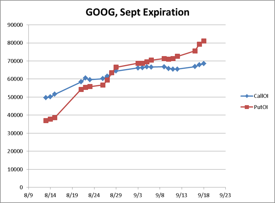
The next is for GOOG, and it shows that call and put OI’s crossed over at the end of August:

At the same time, GOOG was trending upward:

As with all data mining, I’m scratching my head to figure out what it means and if there’s any alpha there. It looks like you would want to fade the increases in OI from these charts. Leave a comment if you have any ideas of the meaning of these charts or other data that would be useful to mine out.